Dovetail Find
Introducing Find Feature To Canvas View
Now that we have developed and implemented the minimum viable product for the "find" feature in Canvas, are there any opportunities for us to enhance the user experience by incorporating elements that will make the "find" experience more delightful for our users?
UI/UX Design
User Research
Product Strategy
THE Problem
Make Canvas Awesome
The team has developed the "find" feature in Canvas and is now evaluating ways to improve the user experience. They are considering various aspects such as highlighting matches, determining color of highlighted matches, keyboard shortcuts, adding a find button and more.
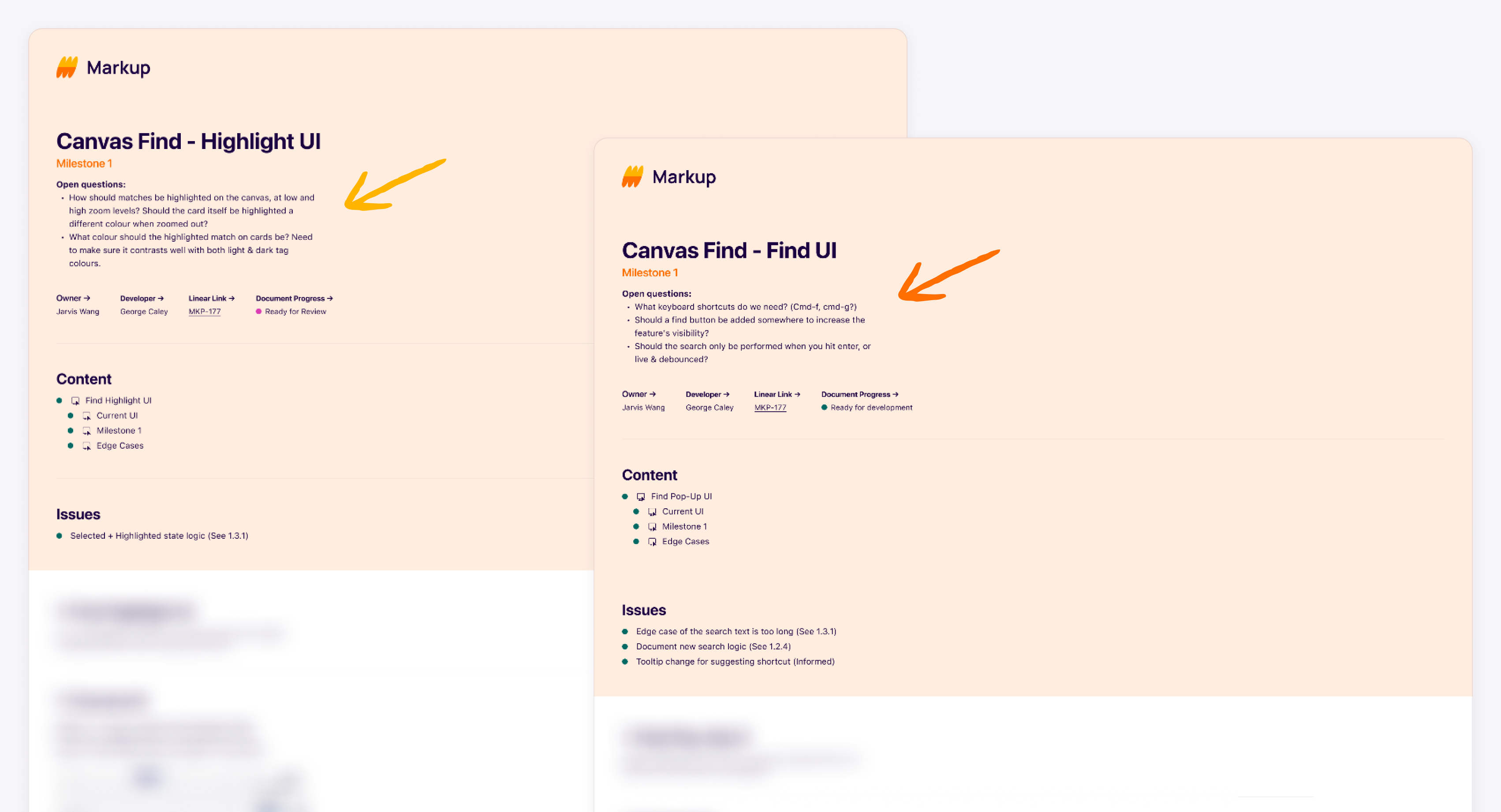
These are the design handover doc for the engineers.
step 1: Identify the problem
Understand the gap and opportunity
Before starting the project, it's important to understand the gaps and opportunities in designing the UI. This will help identify areas for improvement and innovation, develop a clear design strategy and validate design decisions. It will also allow to evaluate the success of the project and make adjustments as needed.

I put all the open questions from the team and myself at the top of the handover doc before the project started.
step 2: ideation and brainstorm
Approach the problem one-by-one
To efficiently address design issues, I will first list down all identified problems. I will then proceed to design solutions for each problem individually. This approach allows me to provide thorough solutions, while also enabling me to prioritize issues based on their level of importance. By breaking down the design process in this way, I am able to ensure that the final design addresses the most critical problems and meets the needs of the users.
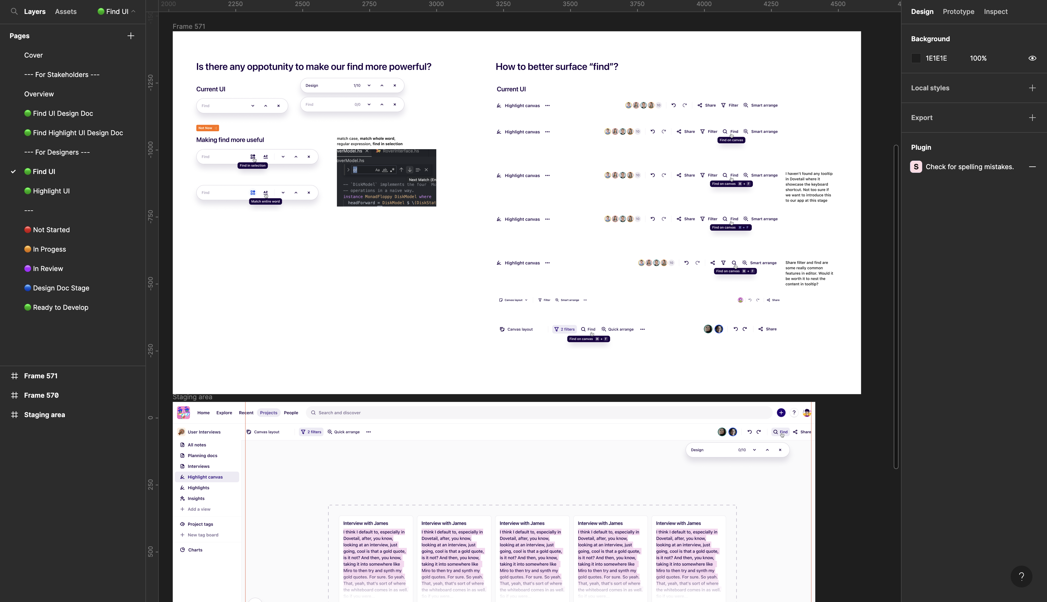
Addressing problem for Find UI

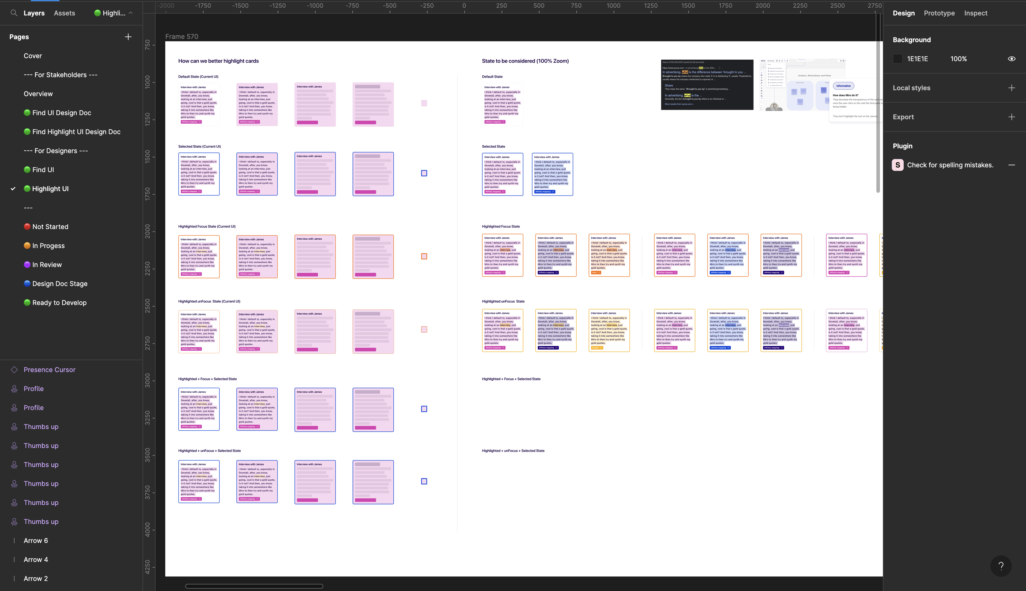
Addressing problem for Highlight UI
Let the team vote on the solution
After designing solutions for each problem, I will present them to the team for voting to ensure collective decision making and to consider diverse perspectives. This approach promotes buy-in and ownership among team members, leading to better implementation and execution of the chosen solution.
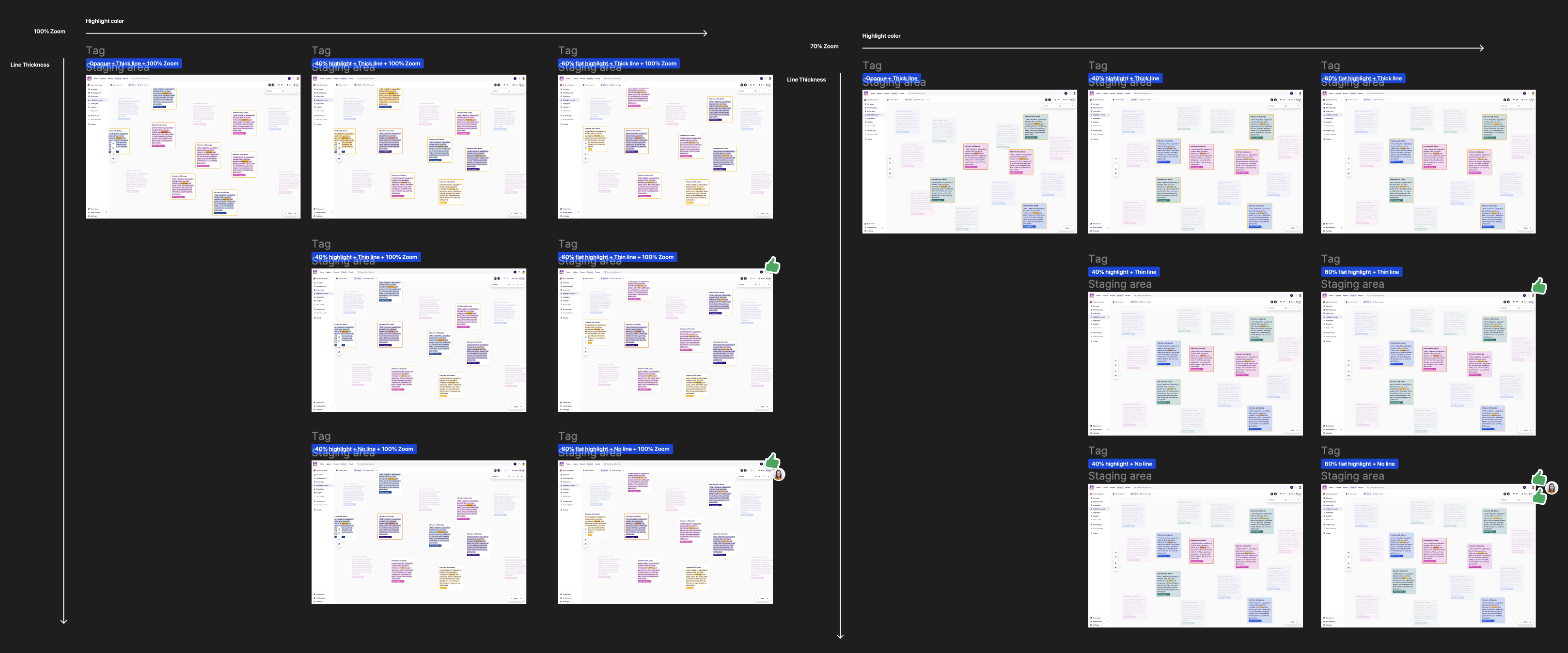
Organizing the solutions and let the team vote on them
step 3: Design Handover
Identify edge cases and address the design specifications
After the team has voted on the solution and a decision has been made, I will then work closely with the engineer to understand the technical constraints and edge cases. This step is critical to ensure that the design solution is feasible and can be effectively implemented in the technical environment.
The following are types of information I put in my design doc:
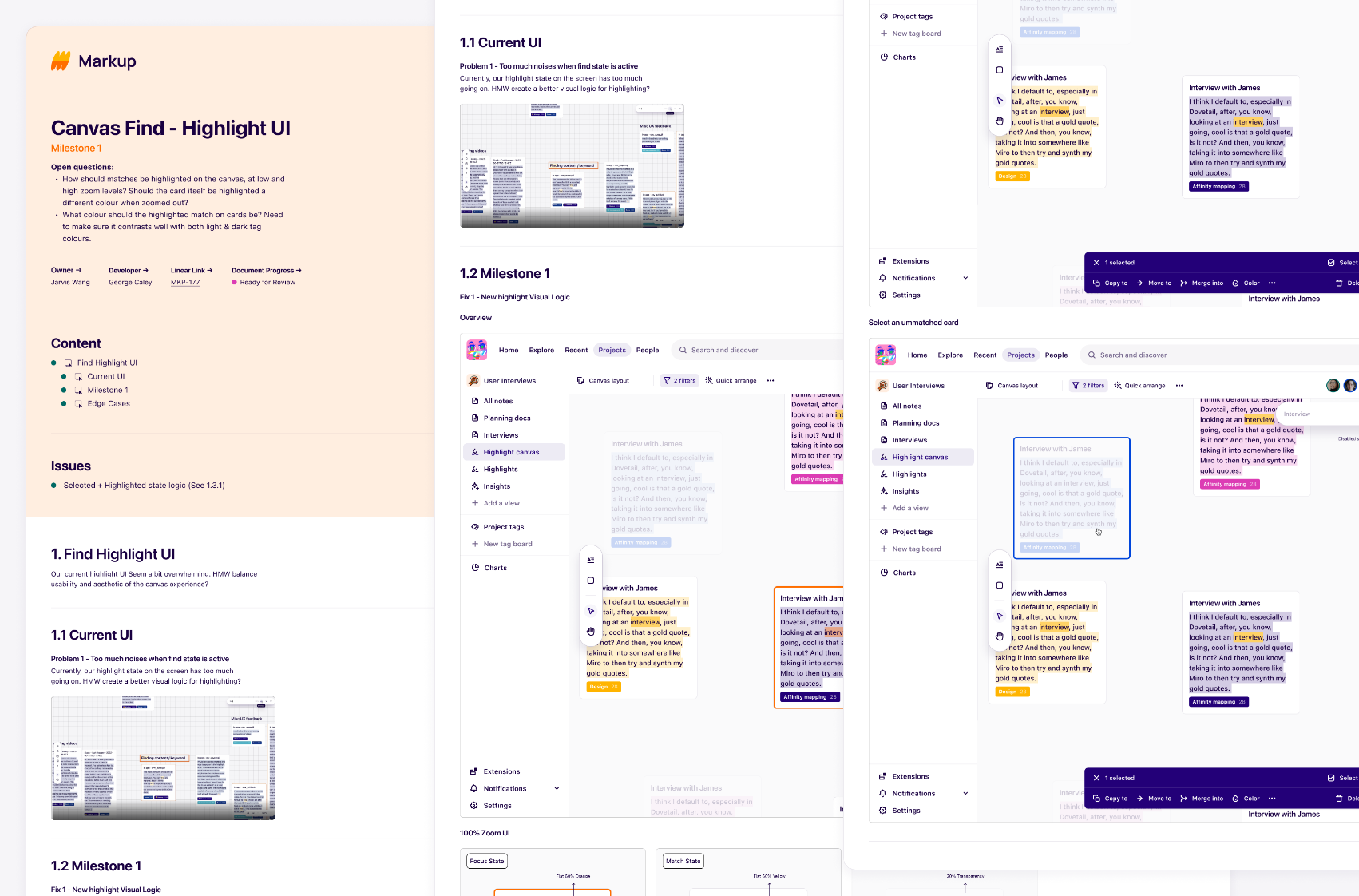
Example output 1: basic UI specification
Basic UI specifications ensure that the final design is consistent, easy to use and aesthetically pleasing. These specifications are important to ensure a consistent and unified look and feel of the product and to provide a positive user experience.

One example for Basic UI Specification
Example output 2: edge case specification
These scenarios are typically outside the normal range of usage, and may include unexpected inputs, extreme conditions, or exceptional situations. Edge case specification ensures that the design can handle these scenarios without breaking or behaving unexpectedly. It also ensures that the product is robust and can withstand unusual circumstances without failing.

One example for edge case specification
Example output 3: cross-system specification
This type of specification is important for products that are integrated with other products, services or platforms, and it ensures that the design is compatible with the other systems. By following cross-system specifications, it will help to ensure that the product can work seamlessly with other systems.

One example for cross-system specification


